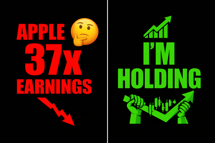
Is Apple Worth 37x Earnings? My Unpopular Answer
I own Apple. It's about 35% of my portfolio. And I just wrote a piece explaining why it looks expensive. That's not a contradiction. That's the whole point. The question isn't 'is Apple expensive today?' The question is 'does Apple still belong in my portfolio?' Different question. Different answer.
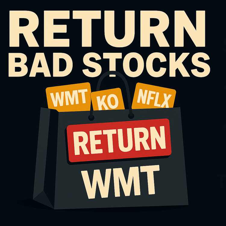
Boxing Day for Your Portfolio
Boxing Day isn’t just for returning bad gifts—use it to return bad positions. Go line by line through your portfolio and ask: “If this were cash today, would I buy it right now?” If the answer’s no, it’s clutter, not an investment.
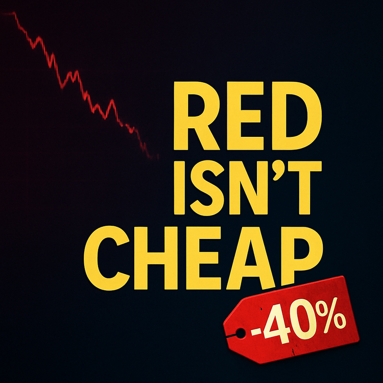
Down 40% Still Isn’t “Cheap”
A stock that’s down 40% isn’t automatically a bargain. It’s just lower. Here’s how to tell if you’re buying a real business on sale—or just catching a broken story on its way to the basement.
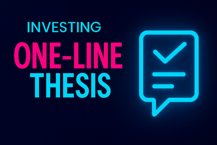
Investing Tip: If You Can’t Say It in One Line, You Don’t Have a Thesis
Most investors don’t have a thesis—they have a story and a ticker. I force every idea into one plain-English sentence I can test a year later. If I can’t, I don’t buy. You don’t need more ideas. You need fewer, clearer ones.
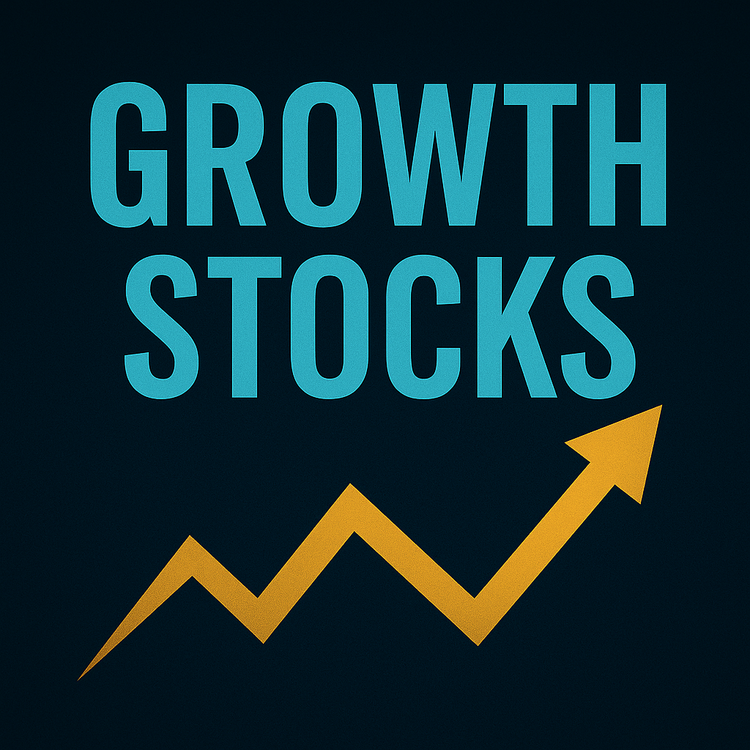
Understanding the Risks and Rewards of Growth Stocks for DIY Investors
Growth stocks create millionaires and wipe them out just as fast. The difference isn't luck- it's discipline. Learn how to spot real growth, avoid hype, and survive the volatility that kills most DIY investors before they ever see the payoff.
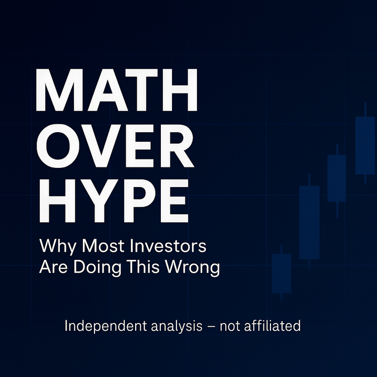
Math Over Hype: Why Most Investors Are Doing This Wrong
Stop chasing narratives. Start reading balance sheets.
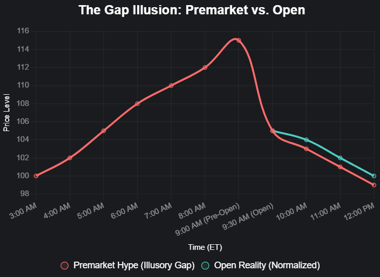
Early Birds and Duds: Unpacking Premarket Moves with a Veteran's Eye
Today's premarket darlings could be tomorrow's duds. Let's dive deeper before you dive in.
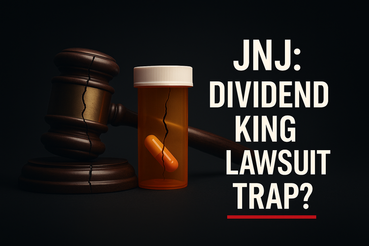
$JNJ: Dividend King or Lawsuit Trap?
JNJ isn’t broken.
But at $188, you’re paying growth multiples for a dividend stock with unlimited liability.
That’s not prudent — that’s hopeful.
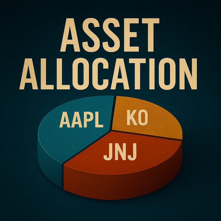
What is Asset Allocation?
Asset allocation isn’t just stocks vs bonds. It’s the skeleton of your portfolio — built on time, goals, and risk tolerance. Get it wrong, and nothing else works.
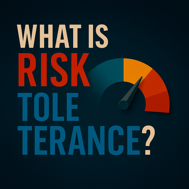
What is Risk Tolerance?
Risk tolerance isn’t a quiz score. It’s your breaking point — the point where volatility forces you to sell or proves you can hold. Here’s how to find it.